Wallpaper is often seen as old-fashioned, but it has been making a noticeable return as designers rediscover what classic wall treatments can do. Since design trends tend to cycle, there is no shortage of vintage wallpaper patterns from past decades that could work well again today.
Many of these older designs can be found in public-domain wallpaper catalogs from the 1950s and earlier, making them easy sources of inspiration. Some come from companies that no longer exist, including Montgomery Ward and Robinson's Golden Rule Wallpaper, names that may be unfamiliar to modern readers.
Nature is a recurring theme, with patterns built around leaves, flowers, and even pine cones. Texture also stands out in many of the designs, and that remains appealing in contemporary homes because it adds both visual interest and a tactile quality. Not every vintage wallpaper deserves a comeback, but the 1950s examples below certainly merit another look.
Jodie
This 1951 catalog sample combines white with pastel pink, blue, and green to give a kitchen a light vintage floral look. Darker touches in the leaves help ground the flowers against blue and white sections, creating a look that feels both delicate and enduring. The original manufacturer also specifically suggested it for kitchens.
Early Dutch Design
Found in a 1954 Sears wallpaper catalog, this overlooked design features ripe red fruit and flowers with green leaf accents arranged in a subtle block pattern. Its color palette is easy to coordinate with dishes, towels, and other kitchen accessories. A breakfast nook would stand out especially well with this paper.
Damask Effect in Silver and Gold
The appeal of this wallpaper comes from both its silver-and-gold detailing and its embossed finish. Together, those elements give a kitchen a more luxurious feel regardless of the room’s existing colors. Montgomery Ward described the paper as fade-proof and tarnish resistant, making it suitable for sunny spaces and for guests who cannot resist touching it.
Grass Cloth
This 1954 pattern, offered in three colors, was more refined than it first appeared. Grass Cloth was made from genuine grasscloth rather than simply imitating the look. Handwoven from natural fibers, it offered strong visual and textural appeal, and grasscloth techniques have since become even more detailed and polished.
The Morning Glory
Exclusive to the Robinson's catalog, this 1951 pattern is dominated by a white background that works well in pale kitchens or as a lighter contrast in darker ones. Its shapes faintly resemble square tilework, giving the design an unexpectedly modern edge. Even if it were reissued, it would not likely sell for the original 15 cents per roll.
Carnival Plaid
Plaid patchwork is one of the most playful retro kitchen wallpaper ideas, and Carnival Plaid lived up to its name with a slightly funfair feel. Its clear plaid influence was broken up by irregular rectangles in colors that worked with gray, yellow, or reddish-brown versions of the design. If it were available again, it would likely appeal to anyone who likes a throwback look with sitcom-era charm.
The Modern, Rough-Textured Walls
Despite its cumbersome title, this Montgomery Ward wallpaper was notably forward-looking because of how much it emphasized texture. The block pattern used embossed green squares for a strong tactile effect, and the brighter square stood out against a darker green background. It has a retro quality that still feels contemporary and could give a kitchen a more polished look.
Kitchie
Described as unusual in the 1951 Robinson's catalog, this pattern takes on a different character now. Its florals and strong pink-and-white palette give it a cozy retro charm that recalls a grandmother’s kitchen. It was originally intended for kitchens and bathrooms, so a modern kitchen would still suit it well.
Shadow Print
Sage green is a reliable choice for a warm, cottage-inspired space, and this 1953 design shows why wallpaper can work just as well as paint. The pattern was notable enough to appear on the cover of Sears’ wallpaper catalog. Light and dark sage blocks were paired with gold lines and embossed floral details, resulting in a design that feels both stylish and distinctive.
The greens are appealing on their own, but they would also pair nicely with the natural green tones of kitchen herbs.
Homespun
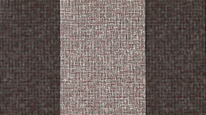
This pattern was created to coordinate with carpets, which are hardly ideal in a kitchen, but its embossed grayish-red surface still gives it visual interest. The texture can work in other ways in a kitchen, echoing linens, oven mitts, and other fabric details. If it were reprinted, it would make an attractive choice for an accent wall near furnishings.
Cool, Clean-Cut, and Refreshing
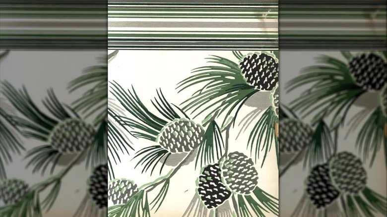
Montgomery Ward’s 1953 wallpaper catalog included this unusual floral alternative, which focused instead on pine cones and needles. The design was presented as cooling thanks to its muted gray and green tones, and those colors would also blend well with brighter kitchen accents. In many ways, the wallpaper itself would be enough of an accent on its own.
More from Digilifetrends
10 things people born in the 1980s have nearly forgotten
If you grew up in the 1980s, you probably remember a time before constant screens and online distractions, but after the shift into the digital age began.
2 min read · Updated 2026-10-1272 Vintage Gadgets That Make Yesterday’s Tech Feel Like True Design
Modern electronics have made daily life far easier than it was a few decades ago. Smartphones now do the work of IDs, wallets, music players, and movie players all at once, and…
5 min read · Updated 2026-10-1272 Retro Gadgets That Show Why Old Tech Still Feels So Cool
Modern electronics have made everyday life much easier than it was a couple of decades ago. Smartphones now double as IDs, wallets, and portable players for music and movies,…
6 min read · Updated 2026-10-12